Datawrapper is a specialized online data visualization tool that enables journalists, researchers, and content creators to generate clean, embeddable, and responsive charts and maps.
Datawrapper is a highly respected, web-based data visualization platform created specifically to meet the rigorous demands of journalists, newsrooms, and public organizations. Designed in Germany, the tool focuses on simplicity, data integrity, and exceptional design standards. It allows users to transform raw data files or live spreadsheets into beautifully designed, highly accurate, and fully responsive charts, maps, and tables without writing a single line of code.
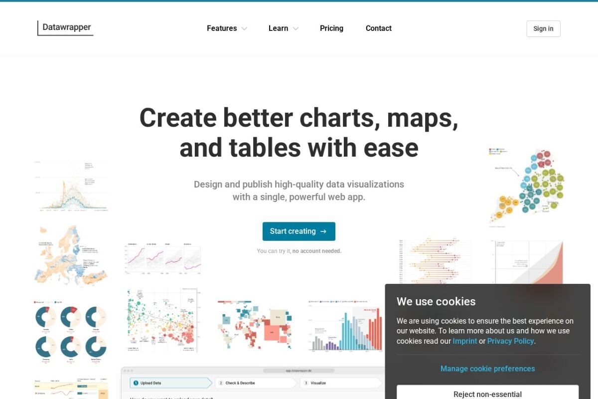
The platform follows a straightforward, four-step workflow: upload data, check and describe, visualize, and publish. Datawrapper excels at creating charts that adapt perfectly to any screen size, ensuring that a visualization looks just as clear on a mobile device as it does on a desktop monitor or a printed page. It offers a wide variety of visualization formats, including bar charts, line graphs, scatter plots, choropleth maps, symbol maps, and searchable data tables with inline sparklines.
One of Datawrapper's core principles is adherence to strict accessibility guidelines (such as WCAG), ensuring visualizations are readable by colorblind users and compatible with screen readers. Large news agencies and corporations utilize Datawrapper’s enterprise features to enforce custom brand guidelines, automatically applying correct fonts, color palettes, and logos to every chart generated. Published visualizations can be embedded into web pages via lightweight iFrames or exported as high-resolution PDF and SVG vector graphics.
Power BI is a powerful business intelligence tool